
Overview
- System Graphs are used to view Graphs of System related activities for different periods of time. The System Graphs can be seen from Monitor & Analyze > Diagnostics > System Graphs.
- The System graph will display the graphs for the selected time periods i.e., Live Graph (the last two hours), Today, Last 48 hours, Weekly, Monthly, Yearly; as shown in following section.
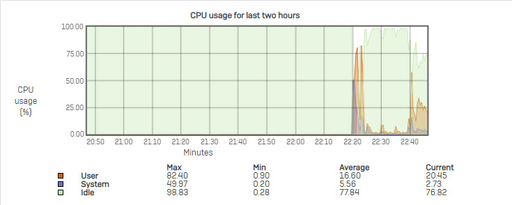
CPU usage Info
CPU Info graphs allow Administrators to monitor CPU usage by the Users and System components. The Graphs display (in percentages) the minimum, maximum, average and current CPU usage by the User and System in addition to the CPU Idle time.
- X-axis –Minutes/Hours/Days/Months (depending on the selected period)
- Y-axis – Usage in percentage
Legends:
- Orange – CPU used by User
- Purple – CPU used by System
- Green – CPU Idle time
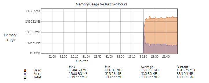
Memory usage Info
Memory Info graphs allow Administrators to monitor the memory usage. The Graph displays (in percentages) minimum, maximum, average and current memory used, free memory and total memory available.
- X-axis – Minutes/Hours/Days/Months (depending on the selected period)
- Y-axis – Memory used in MB
Legends:
- Orange – Memory used
- Purple – Free Memory
- Green – Total Memory
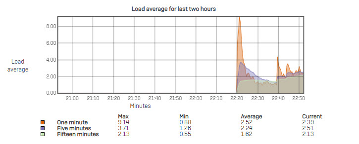
Load Average
Load Average graphs allow Administrators to monitor the load on the System. The Graphs display the minimum, maximum, average and current load on the System at the intervals of one minute, five minute, and fifteen minutes.
- X-axis – Minutes/Hours/Days/Months (depending on the selected period)
- Y-axis – Load Average Index
Legends:
- Orange – One minute
- Purple – Five minutes
- Green – Fifteen minutes
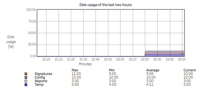
Disk Usage
The Graph displays (in percentages) the minimum, maximum, average and currently used disk space by various components.
- X-axis – Minutes/Hours/Days/Months (depending on the selected period selected)
- Y-axis – Disk usage in percentage
Legends:
- Orange – Disk space used by Signatures
- Purple – Disk space used by Config files
- Green – Disk space used by Reports
- Blue – Disk space used by Temp
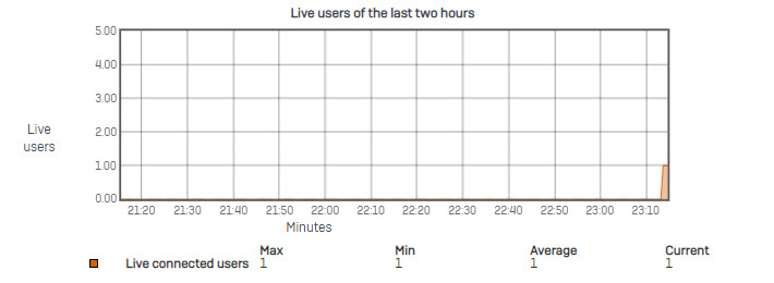
Number of Live Users
Live User graphs allow Administrators to monitor the number of live users for the selected period of time.
Live Users Graph displays number of users (live) connected to the Internet. In addition, it shows the minimum, maximum and average number of users connected during the selected time period. This will help in knowing the peak hour(s) of the day.
- X-axis – Minutes/Hours/Days/Months (depending on the selected period)
- Y-axis – Number of Users
Legends:
- Orange – Number of Live Connected Users
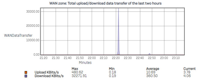
Data transfer through the WAN Zone
Data transfer graphs for the WAN zone is separated into three (3) graphs providing the various information about data transfer via WAN zone.
Total upload/download Data Transfer of the Last Two Hours – this Graph displays a combined graph of Upload & Download data transfer information. Colors differentiate upload & download data traffic. In addition, it shows the minimum, maximum and average data transfer for upload & download separately.
- X axis – Minutes/Hours/Days/Months (depending on the selected period)
- Y-axis – Upload/Download in KBits/Second
Legends:
- Orange – Upload traffic
- Purple – Download traffic
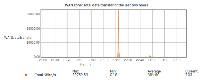
Total Data Transfer of the Last Two Hours – Graph displays the total data transfer from the WAN Zone. In addition, it shows the minimum, maximum and average data transfer.
- X axis – Minutes/Hours/Days/Months (depending on the selected period)
- Y-axis – Upload+Download in KBits/Second
Legends:
- Orange – Total (Upload+Download) Traffic
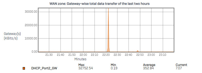
Gateway Total Data Transfer of the Last Two Hours: the Graph displays the gateways’ data transfer from the WAN Zone. In addition, it shows the minimum, maximum and average data transfer of each gateway.
- X axis – Minutes/Hours/Days/Months (depending on the selected period)
- Y-axis – Upload+Download in KBits/Second
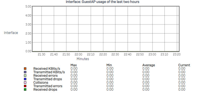
Interface usage Info
Interface Info graph displays the following traffic statistics for all the Interfaces (physical interfaces, VLAN interfaces, Wireless LAN and WAN interfaces):
- Errors occurred while transmitting and receiving packets through the Interface
- Packets dropped while transmitting and receiving packets through the Interface
- X-axis – Minutes/Hours/Days/Months (depending on the period selected)
- Y-axis – KBits/Sec
- Today and Yesterday Graphs are plotted at the average of 5 minutes.
- Weekly Graph is plotted at the average of 15 minutes.
- Monthly Graph is plotted at the average of 6 Hours
- Yearly Graph is plotted at the average of 1 Day
Legends:
- Orange – Bits Received (kbits/sec)
- Purple – Bits Transmitted (kbits/sec)
- Light Green – Received Errors
- Blue – Bits Transmitted but Dropped
- Pink – Collisions
- Red – Transmitted Errors
- Dark Green – Bits Received but Dropped
These terms are defined and explained here:
- Received KBits/Sec: Traffic Received on the respective interface in KBits/Sec.
- Transmitted KBits/Sec: Traffic Transmitted from the respective interface in KBits/Sec.
- Received Errors: This is the number of errors occurred while receiving packets on an interface. Note: Packets will be dropped if this is the case.
- Transmitted Drops: This is the number of packet drops occurred while transmitting packets due to the transmit buffer being full.
- Collisions: This is the Number of Collisions detected in packet reception/transmission on respective interface.
- Transmitted Errors: This is the number of errors occurred while transmitting packets on an interface. Note: Packets will be dropped if this is the case.
- Received Drops: This is the number of packet drops that occurred while receiving packets due to the receive buffer being full.
There are some interesting points in time in this article but I don’t know if I see all of them center to heart. There is some validity but I will take hold opinion until I look into it further. Good article , thanks and we want more! Added to FeedBurner as well
Remember to look forward to our next articles
An interesting discussion is worth comment. I think that you should write more on this topic, it might not be a taboo subject but generally people are not enough to speak on such topics. To the next. Cheers
Thanks for watching
You made some decent points there. I looked on the internet for the issue and found most individuals will go along with with your website.
Thanks for watching!
Please continue to support us.